Datawrapper 图表类型
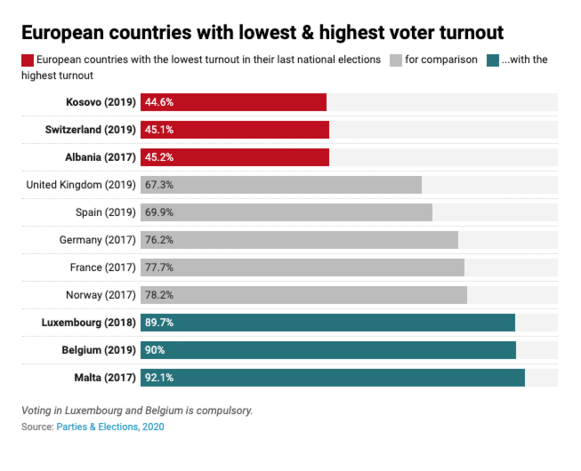
Bar chart
The classic bar chart — unbeaten in simplicity, and more readable than a column chart on mobile screens. Adjust its design to your needs in Datawrapper.
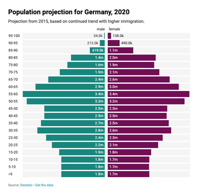
Split bars
Great for population pyramids, or for all other cases when you want readers to compare categories across multiple columns.
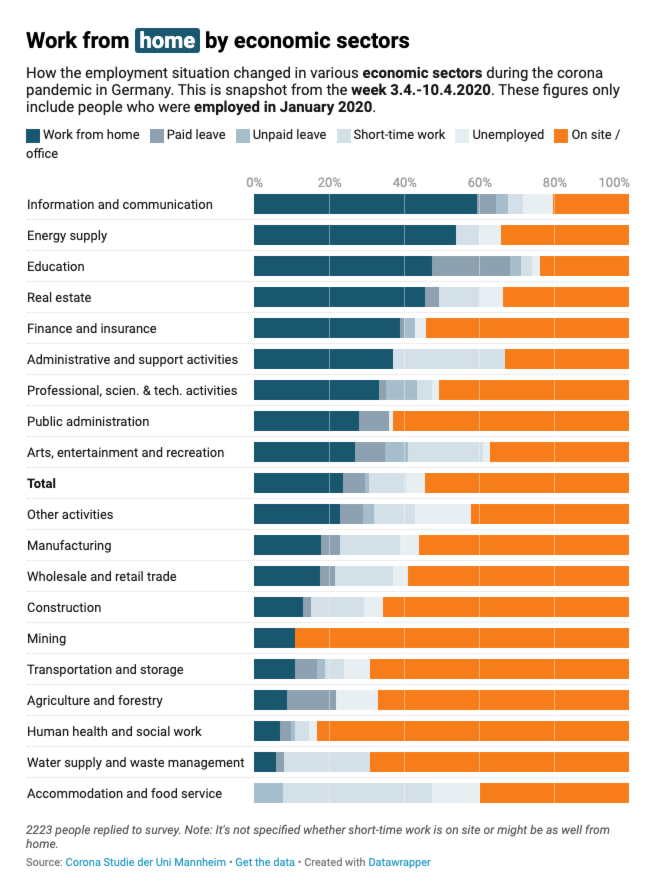
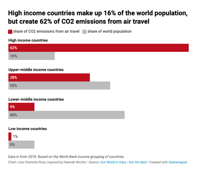
Stacked bars
A popular choice to visualize poll results on an “Agree” to “Disagree” scale — and helpful for all situations when you want your readers to compare shares in different categories.
Grouped bars
A helpful variation on the classic bar chart to compare values across two or more categories.
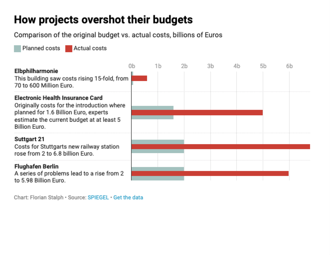
Bullet bars
If you want to show how planned or estimated numbers compare to actual ones, bullet charts are a good choice.
Dot plot
Dot plots are similar to bar charts, but don’t need to start at zero. You can show multiple dots per category, making them a space-saving choice.
Range plot
Range plots are great to show the difference between two variables. It�’s an efficient alternative to using grouped bar charts.
Arrow plot
Arrow plots are useful to compare a metric in different categories at two times, like today and three years ago.
![]()
Column chart
The classic column chart is easy to read, and useful for more than just categories. Datawrapper column charts can have dates on their x-axes, making them a good choice to show how something develops over time.
Grouped column chart
A helpful variation on the classic column chart to compare values across two or more categories.
Stacked column chart
To show which sub-categories your categories are made of, the stacked column chart is a good choice.
Area chart
Similar to the line chart, the area chart can show developments over time in multiple categories — as well the sum of their values.
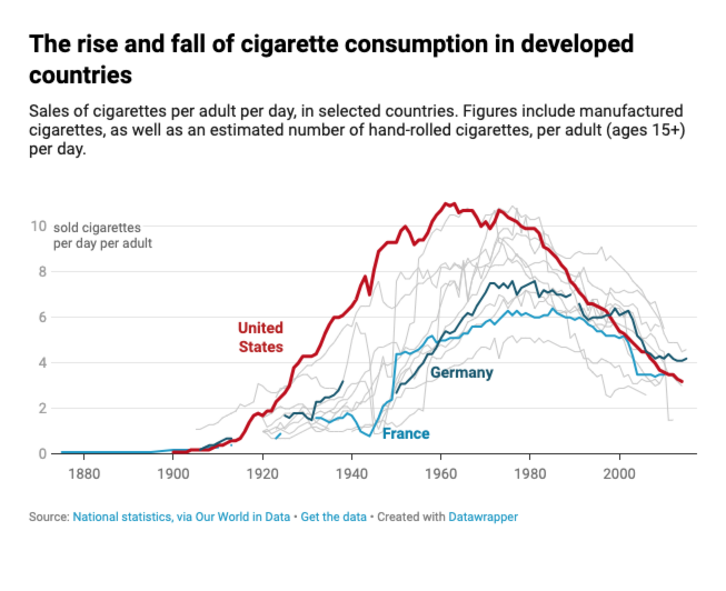
Line chart
Line charts are great to show developments over time. They’re especially helpful when labeled directly, like the country labels in the chart on the right.
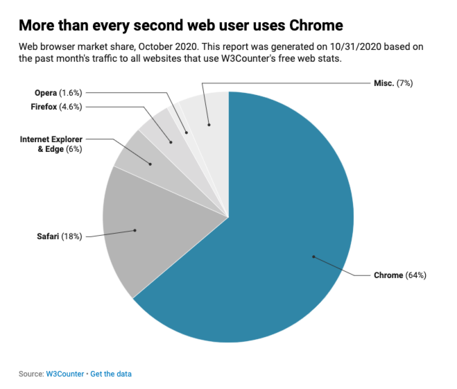
Pie chart
Unloved by some, pie charts are very intuitive when you want to show shares of a whole — and therefore earn their place in our chart type collection.
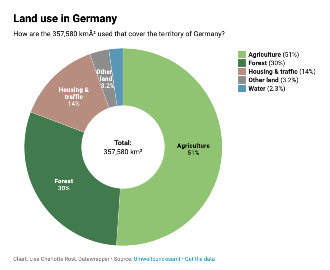
Donut chart
Donut charts are similar to pie charts, but offer space in the donut hole for extra information.
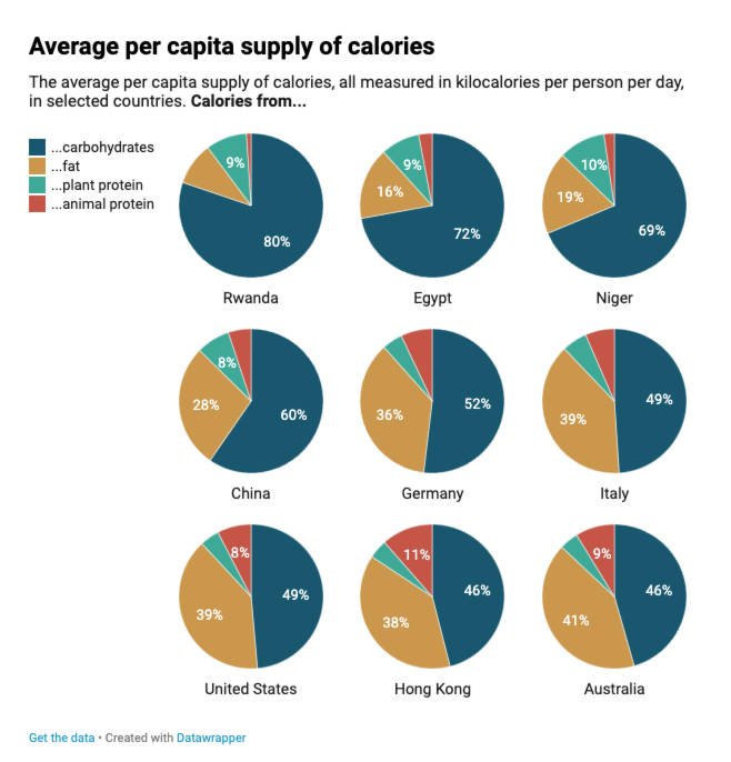
Multiple pies
Sometimes, one pie isn’t enough. Multiple pies are an engaging way to compare multiple categories and their shares with each other.
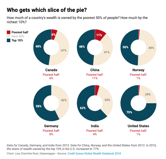
Multiple donuts
What’s better than one donut? Multiple donuts! Like the single donut, multiple donuts offer space for some extra information — which you can use, but don’t have to.
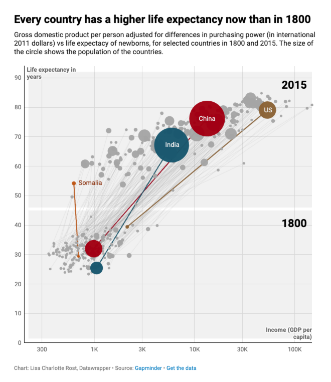
Scatter plot
Scatter plots are useful to show the correlation between two (or more!) variables. Like between ice cream consumption and happiness. Or between Datawrapper usage and beautiful charts.
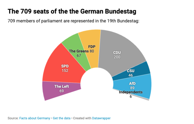
Election donut
Parliament charts or election donuts are an intuitive way to show which parties sit in a legislature.